Digital Driver's License - Spring 2025
NY Digital ID
Overview
A digital driver's license. The purpose of this project was to create an interface that can display important information, while maintaining a sense of security and style, leaning away from the standard "government issued" version of Mobile ID's.
Objective
Create a digital driver's license that fulfils two cases: a Full Information View and an Age Verification View.
Research
Competitive Analysis
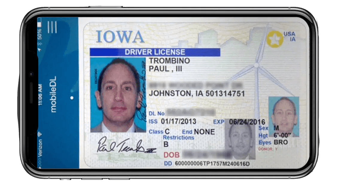
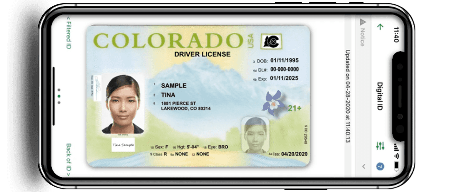
Many digital IDs are just a scan of a driver’s license put onto your phone. This offers no benefit, as a physical copy of your license is almost always necessary when needed, not just a picture of it. The information architecture is also limited, as they are following the guidelines of the actual card, and not of a mobile interface. Even some digital IDs that transform the information into digital format, still fall into a boring style, and ultimately, are only there to be scanned by another device.
The Solution
Create a secure, safe, and expressive digital experience for a standard driver’s license. Convey the necessary information in a unique yet presentable way.
Ideation
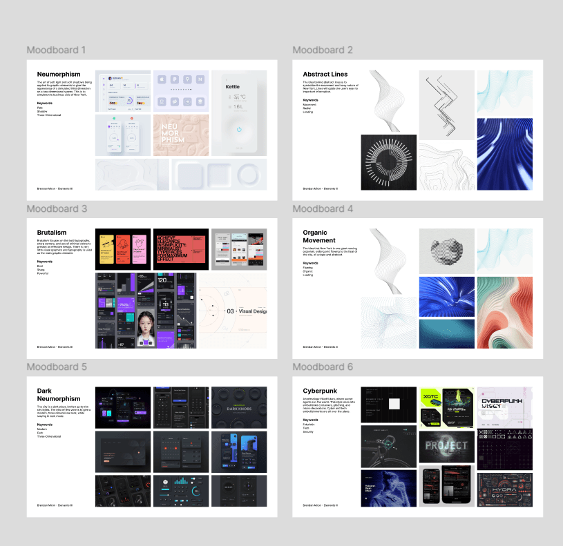
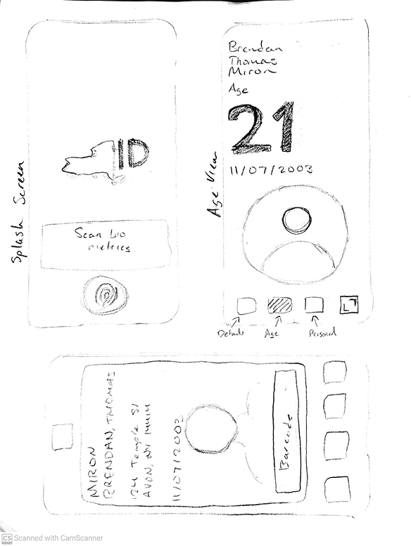
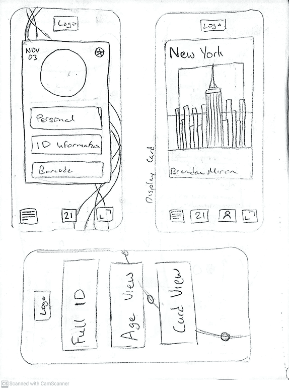
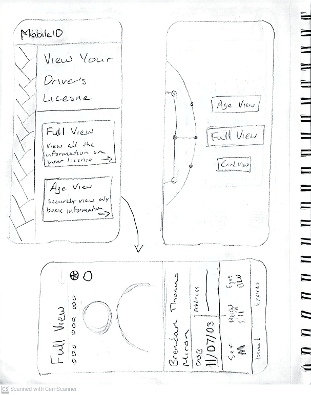
Moodboards
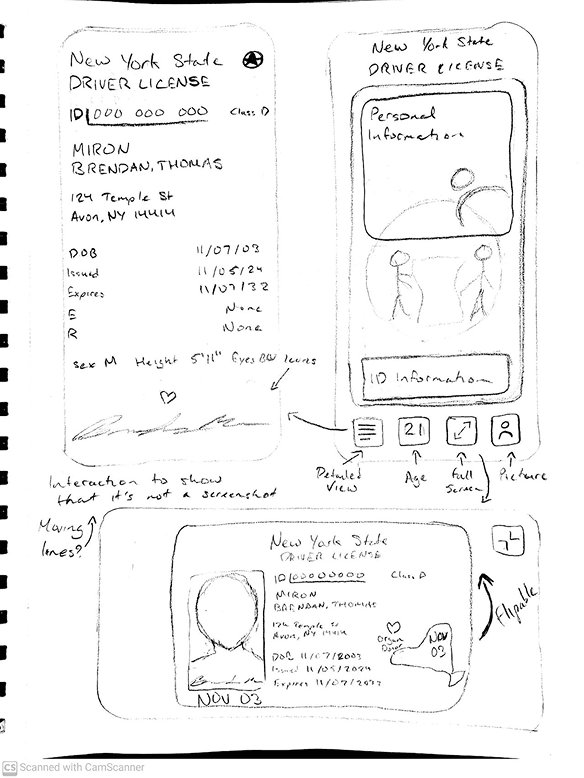
Sketches
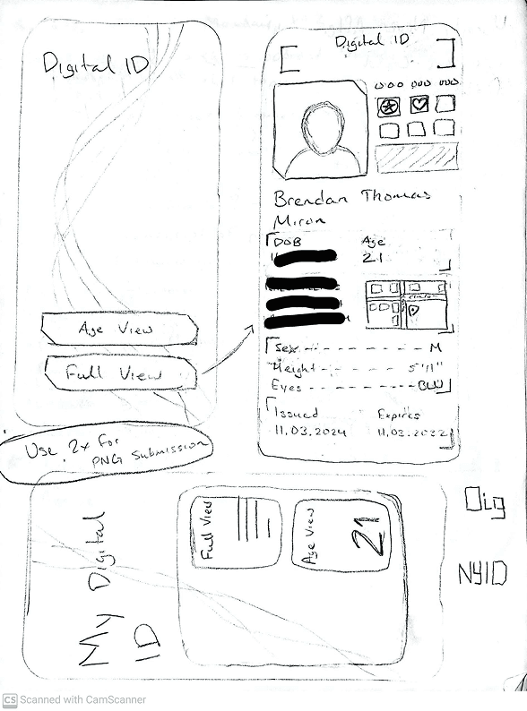
Wireframes - Playing with Style
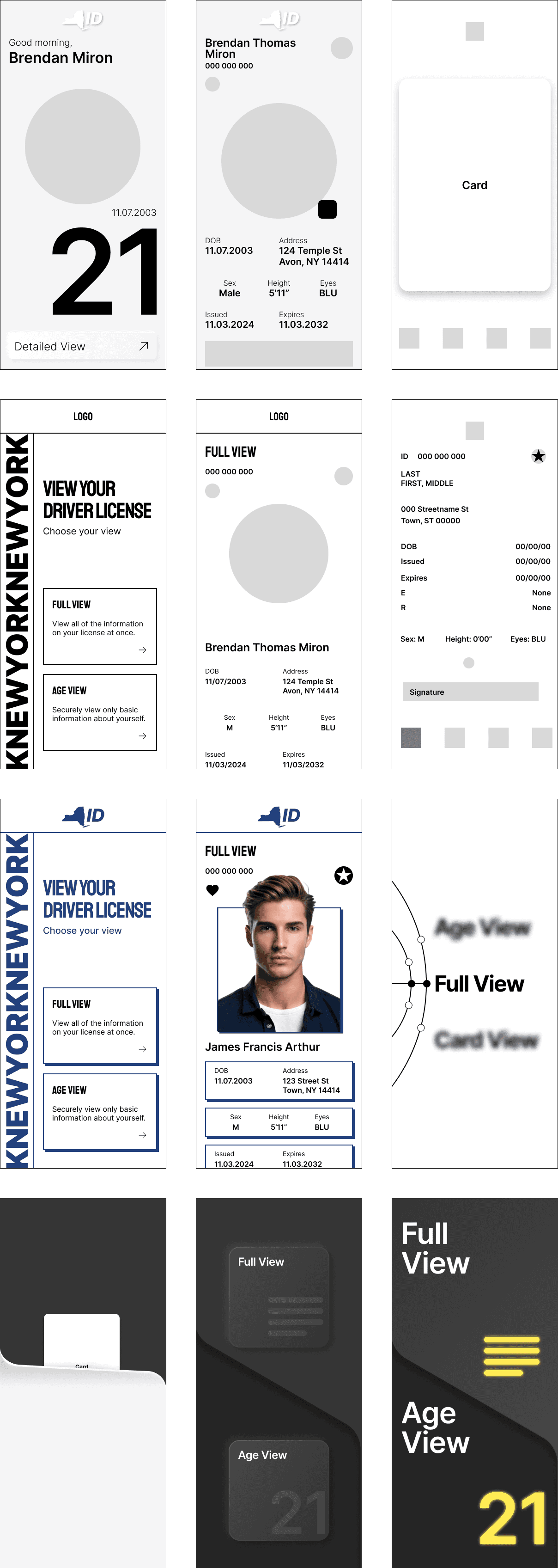
Hi-fi
Final Concepts
I decided to go with a cyber style for my design. I thought the futuristic aesthetic fit well with the progress of New York, as well as represented security for the user. I chose blue as an accent color to represent trust and security.
Final Screens
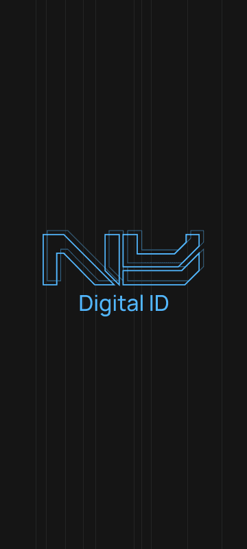
Splash Screen
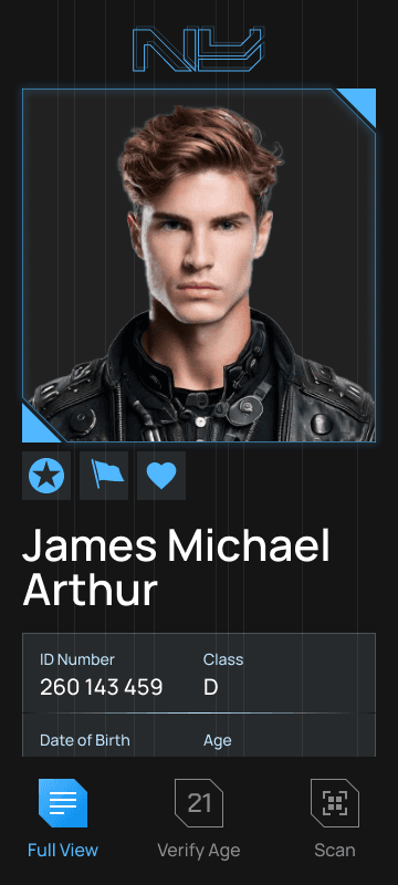
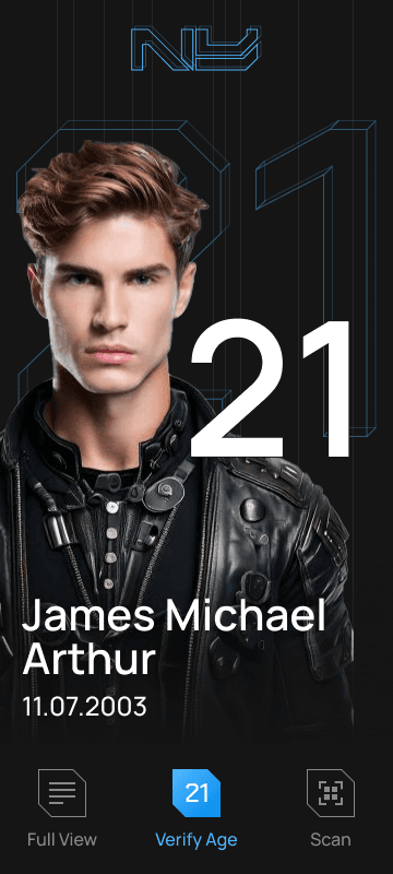
Full Information View
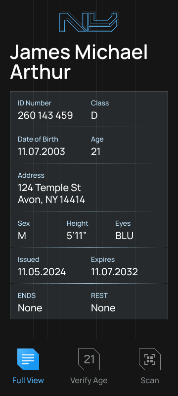
Full View - Scroll
Verify Age View
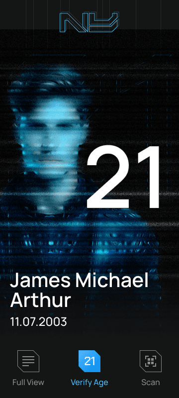
Verify Age - Glitch Verification
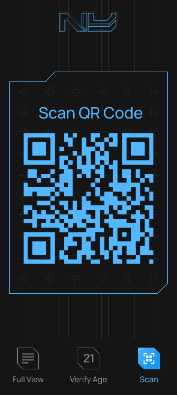
QR Scan View
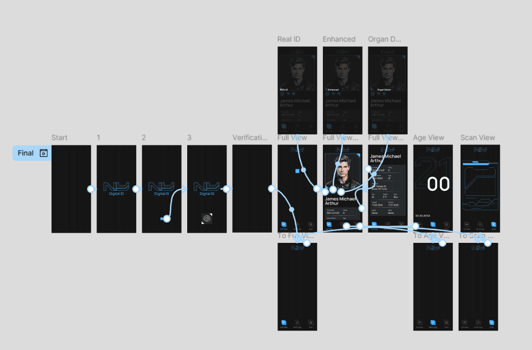
Prototyping of Final Flow
Wrapping Up
What I Learned
Animation is not just the cherry on top of a design, it is a foundational part of the design that aids a better user experience. After I had finished this project, my professor gave me a lot of reading to do regarding transitions and micro animations, and how to effectively communicate an interface through animations.
I also learned that there is such a thing as too much of a style. Originally, I fell into the hole of designing my UI to make everything cyber-styled. The font, icons, background, and containers were all very gamified, and it drew away from the actual content. Therefore, I tried to have a mixture of the futuristic cyber style with more modern UI elements, which I think I was able to effectively portray.
Of course, I will be going back to this project to explore transition animations, After Effects, and improve the interface.