Interactive Diorama - Spring 2025
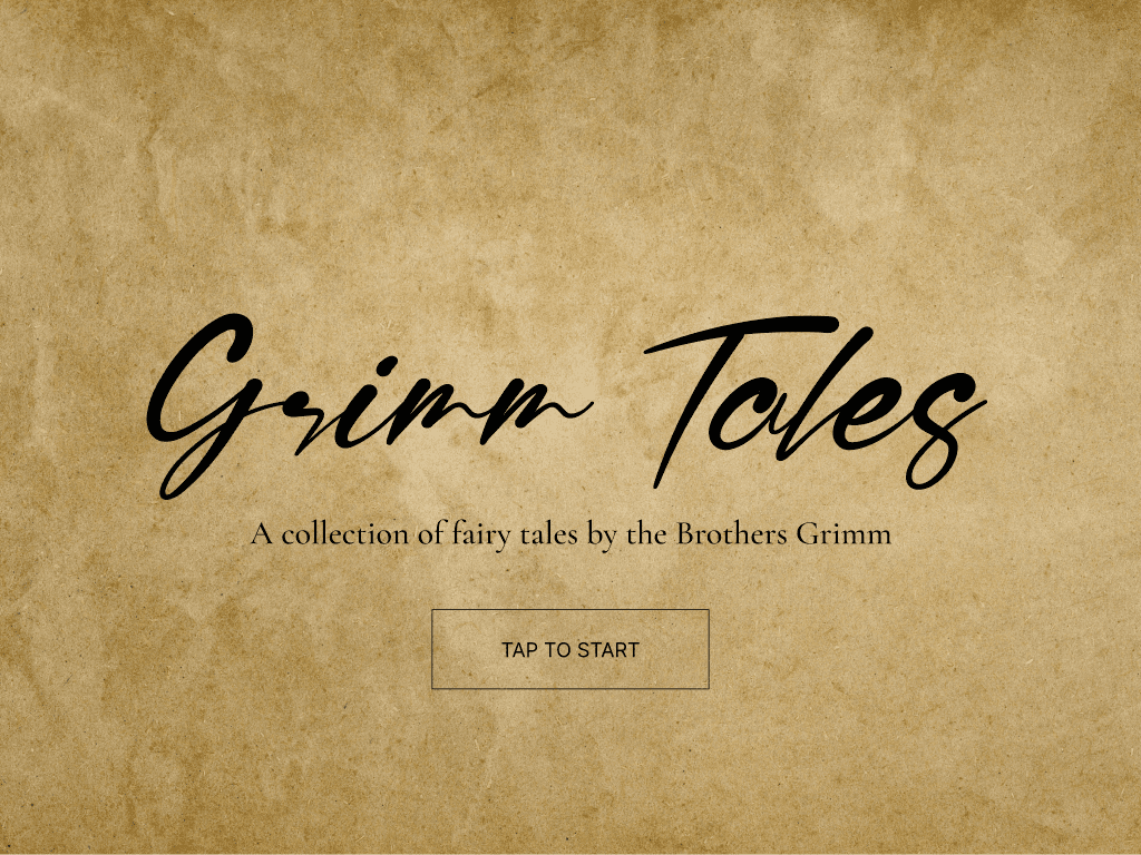
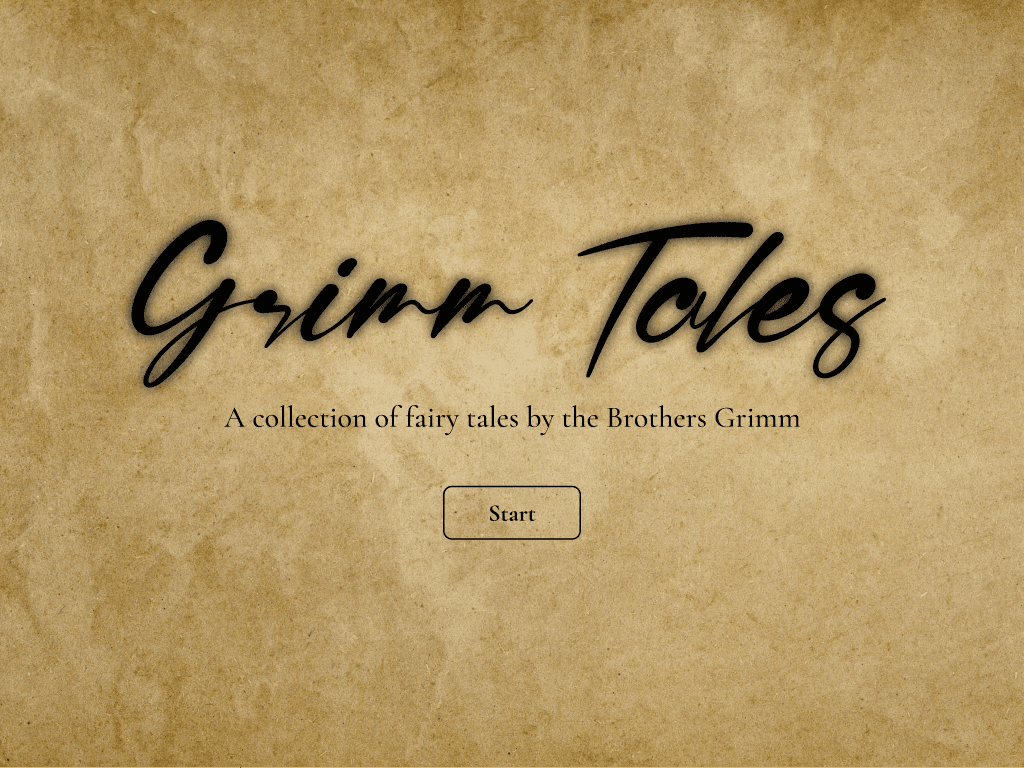
Grimm Tales
Overview
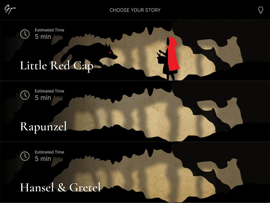
An interactive diorama experience that tells the stories behind the fairy tales collected by the Brothers Grimm, to encourage learning and broaden the audience of fairy tales in general.
Objective
Create a unique interactive experience for a tablet or desktop port to teach or inform an audience.
Problem
It is difficult to find resources that provide an engaging and memorable experience, besides popularized media such as cartoons, television series, and an assortment of video games. The true nature of these fairy tales are often lost in translation, leaving the hidden meanings in the dark.
Project Goal
Create and design an original, unique interaction that combines unique visuals and information to provide an engaging learning experience.
Research
Target Audience & Device
Young teens and adults who like to learn about history and literature will be the target audience for this experience. The target device will be a Large Tablet display, on a 12.9” iPad. I imagine this experience to be inside of a history museum, as its own exhibit.
Topic Research
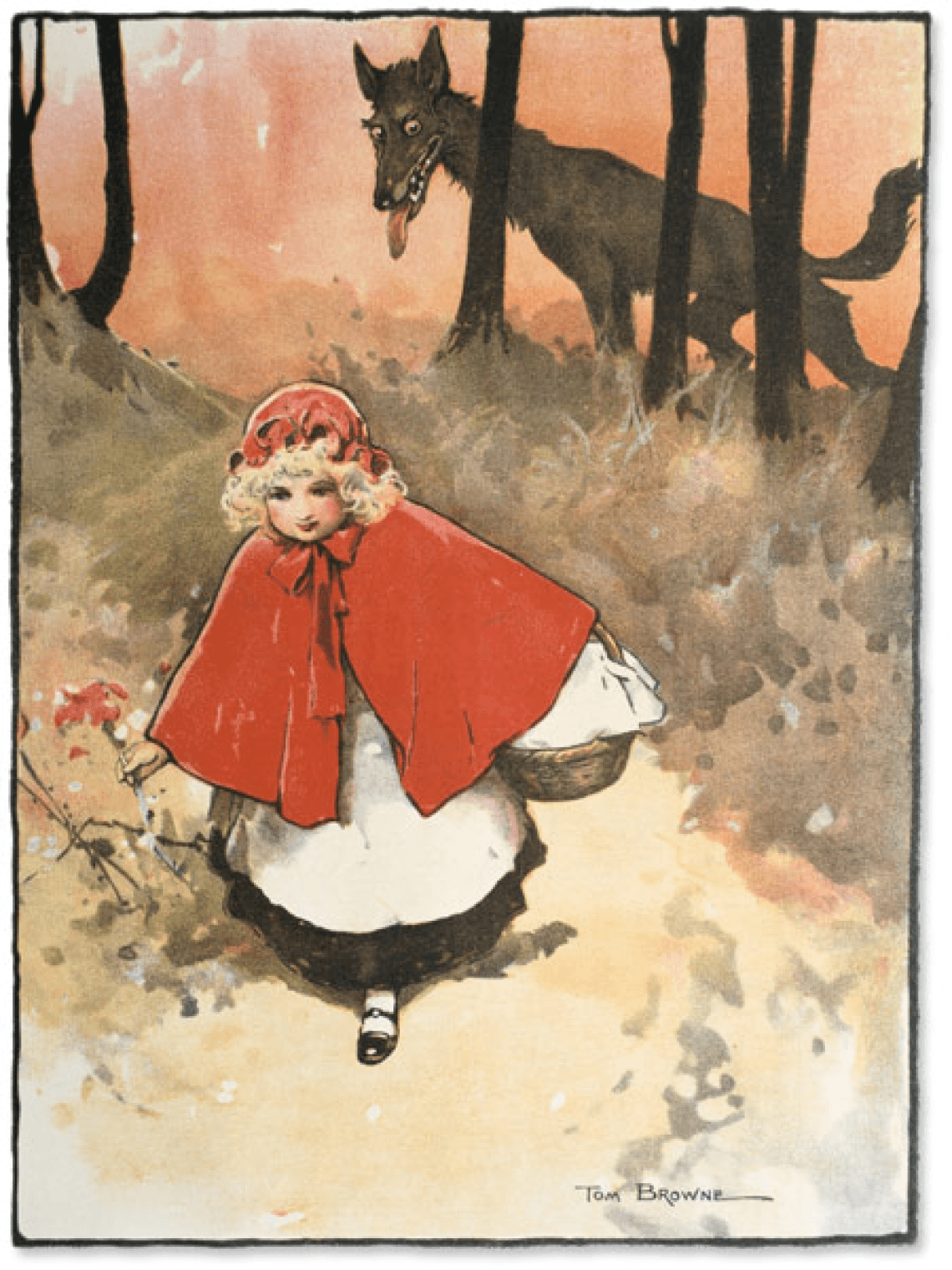
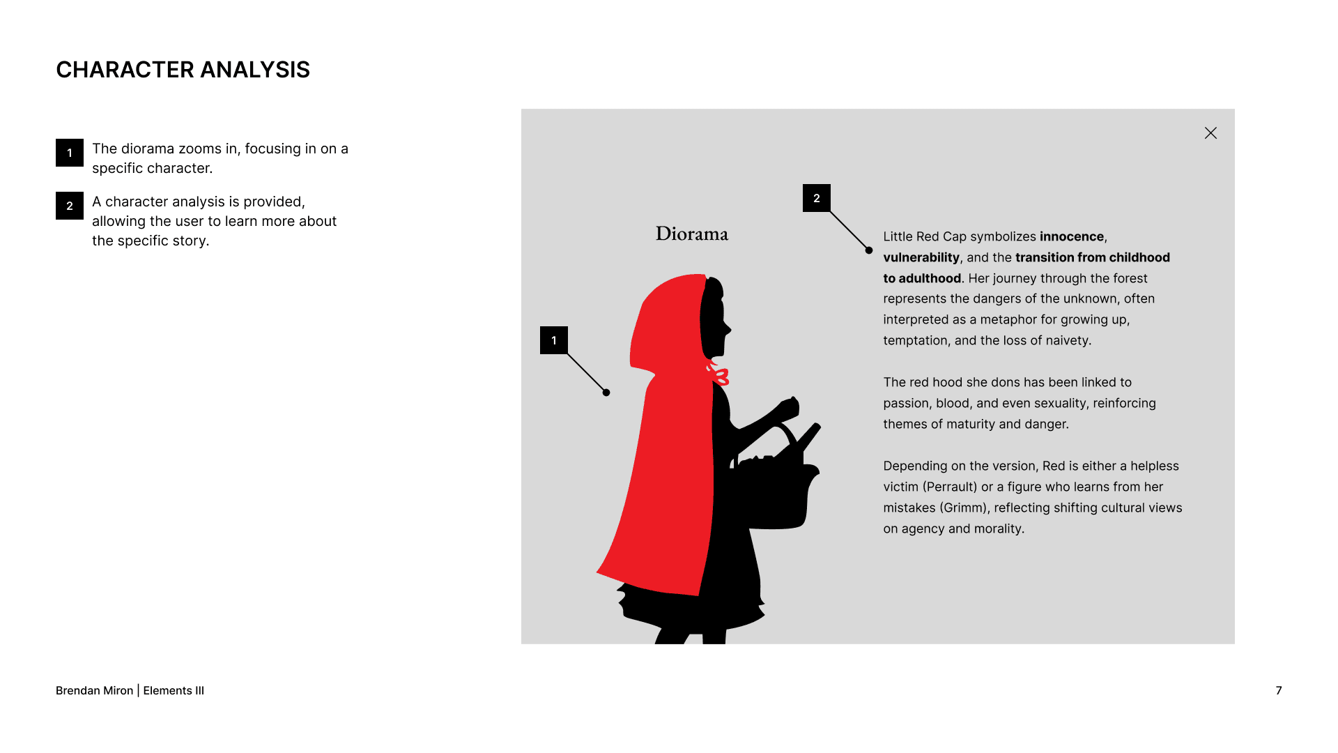
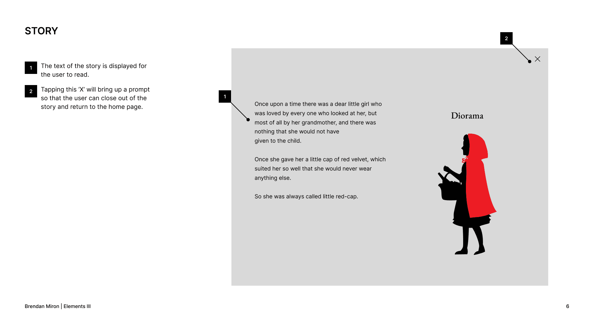
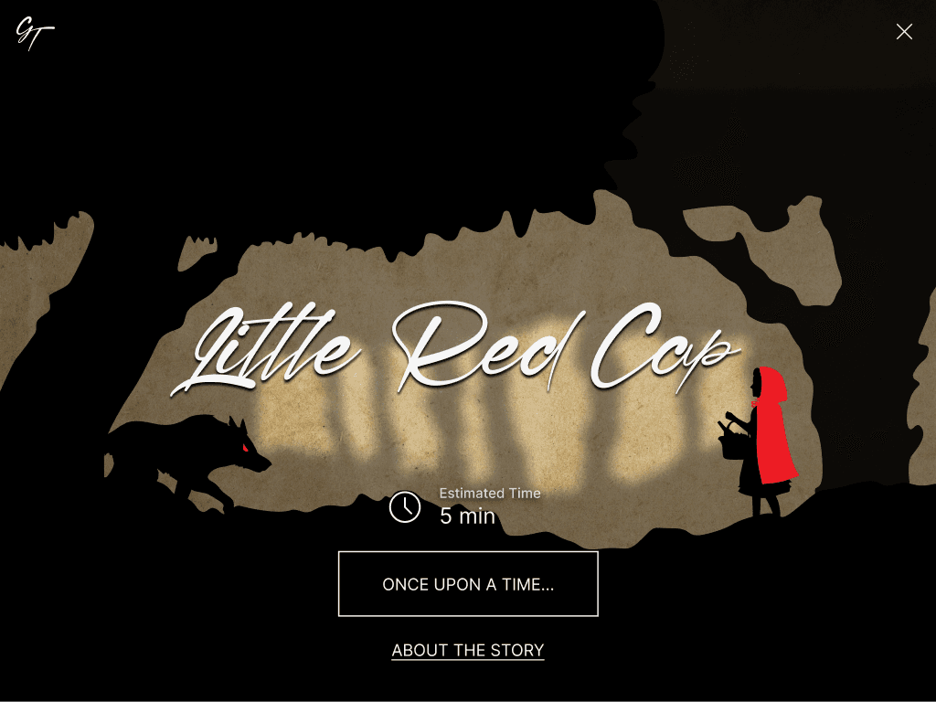
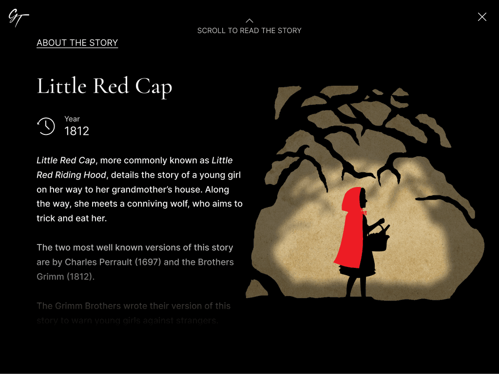
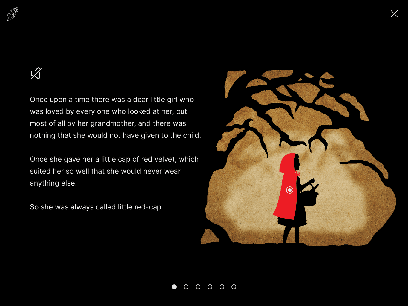
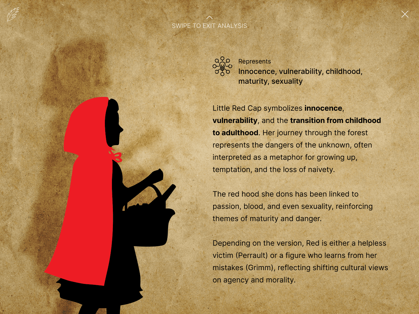
To prepare for this project, I spent quite a bit of time reading the original Little Red Cap story. This helped me get a better sense of what the story is actually about; the metaphors.
After reading articles and watching numerous videos on the true meaning behind Little Red Cap, I began to understand what the story was meant to represent during the time period of the Grimm Brothers.
The titular young girl in the story is a representation of innocence and maturity; a coming of age type of character. The wolf is meant to represent the antithesis of that: ill-intensions and the dangers of men.
Competitive Analysis
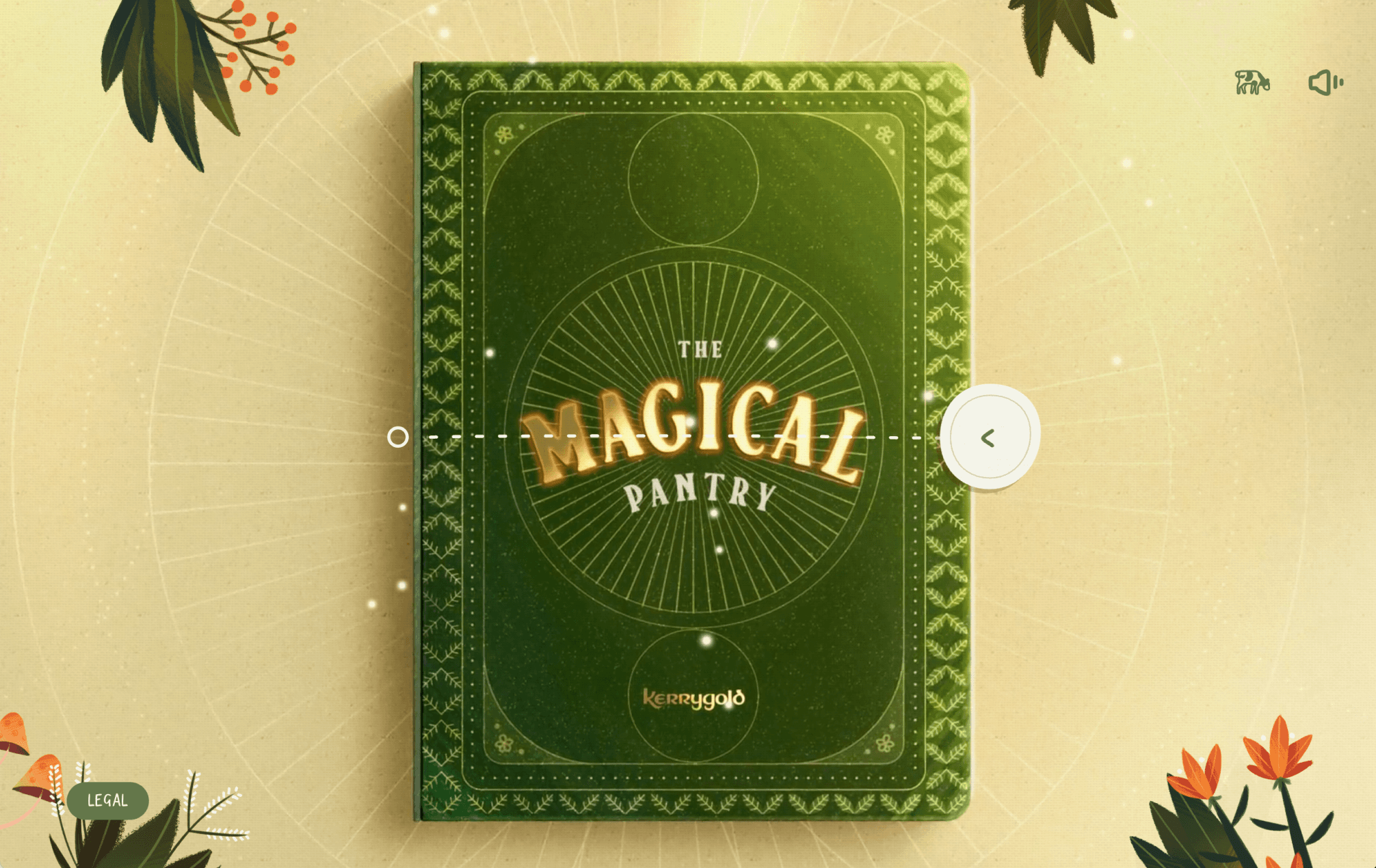
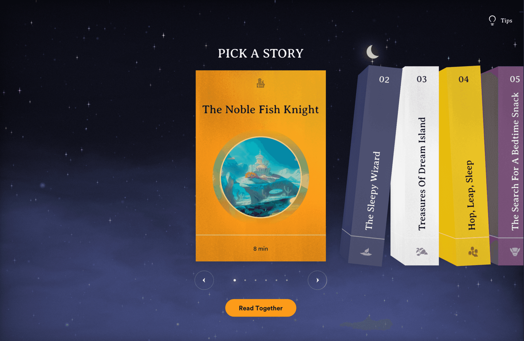
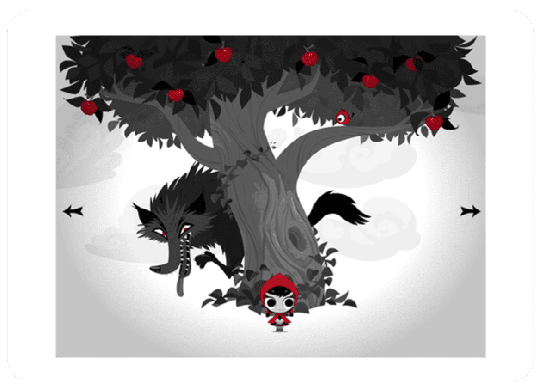
To learn who my competitors were, and what other products were doing in the realm of interactable storytelling, I ran a competitive analysis against multiple digital products. Most notably, Kerrygold | The Magical Pantry, Storytime with Nigel, and Lil' Red - An Interactive Story.
I was actually quite surprised to find an experience that was similar to my idea, even as close as being about Little Red Riding Hood (Or Little Red Cap, as you will see later in this project).
Through these analyses, I learned a lot about how these products use interaction, how they handle transitions, and how to lay out the interface.
I also came to the realization of how to shift my audience to a more mature one. Most of these storytelling experiences are catered towards a younger audience, but I wanted to reach a more mature one, making it imperative that I lay out information and design elements to match that desired audience.
UX Trends
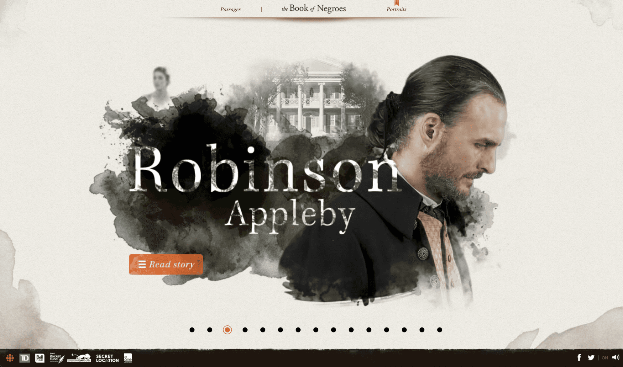
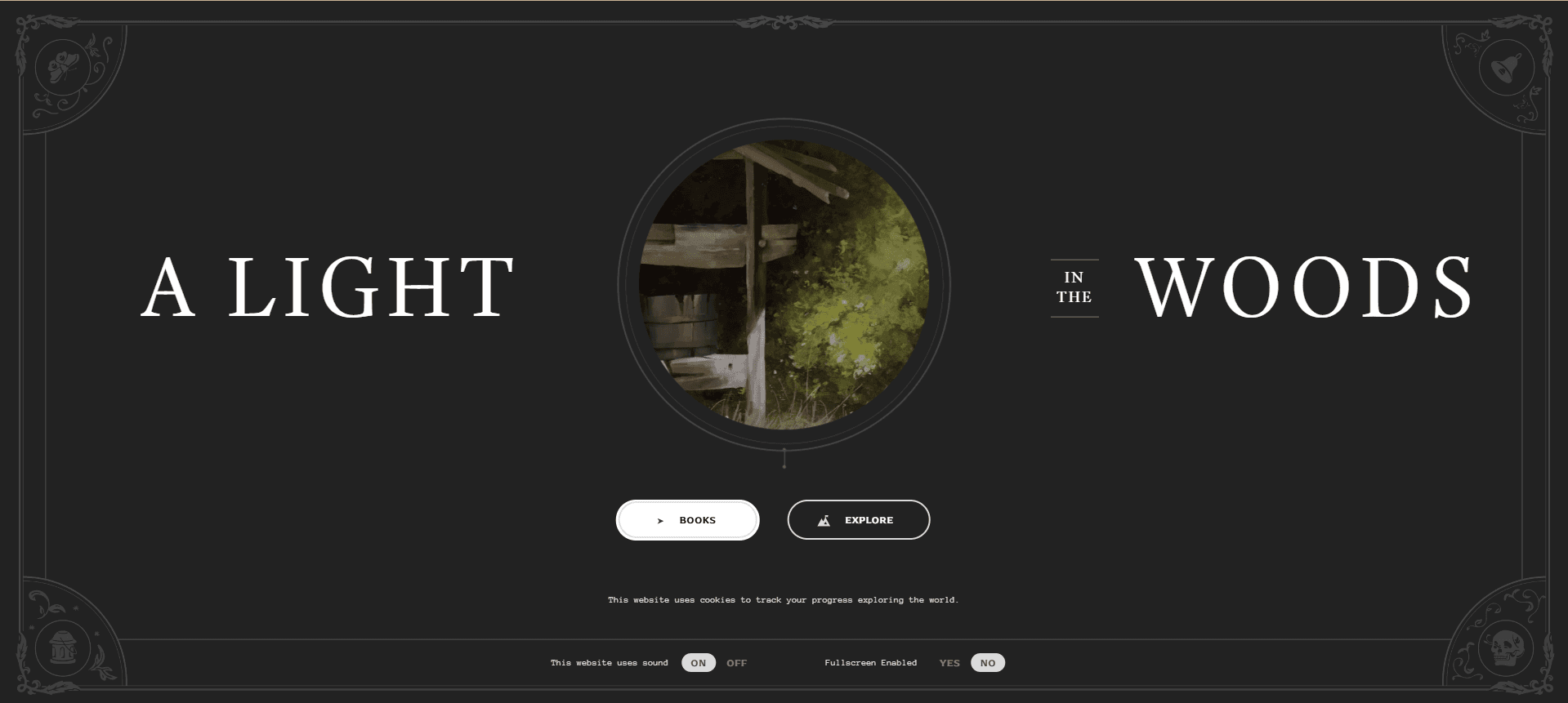
Next, I began looking for sources of inspiration regarding visual style and animations. The Book of Negroes provided an excellent source for the vision that I already had. Watercolor/ink-like textures with a professional vibe was pretty much exactly what I was going for. This also gave me lots of insight to animations with ink splotches that I would use later. A Light in the Woods also provided tons of visualizations for text animations and transitions. Having these projects to reference was incredibly helpful to bring this project to life.
Ideation
Site map
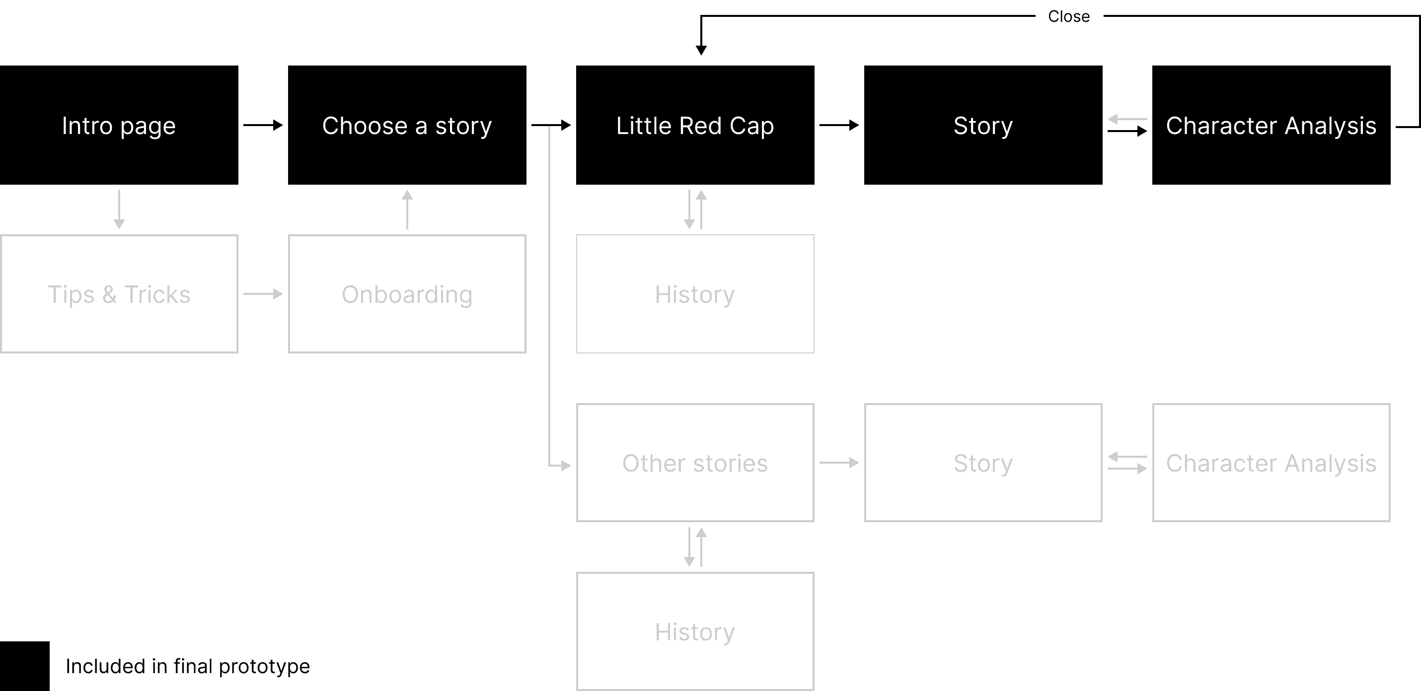
Prototype Plan

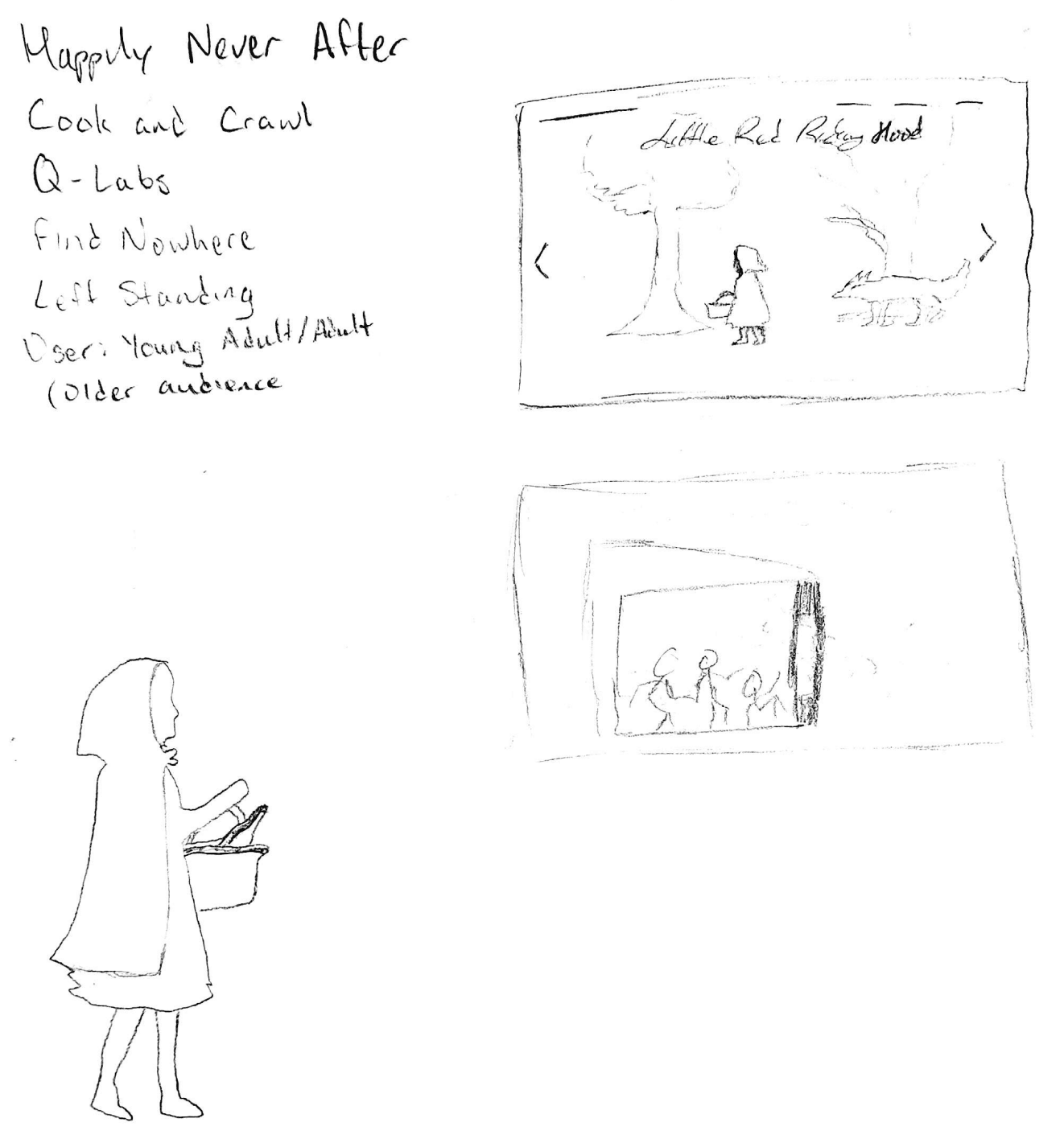
Sketches
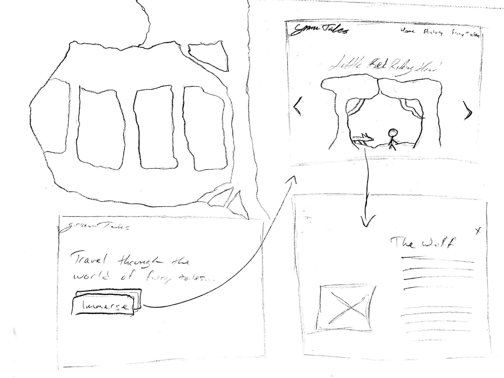
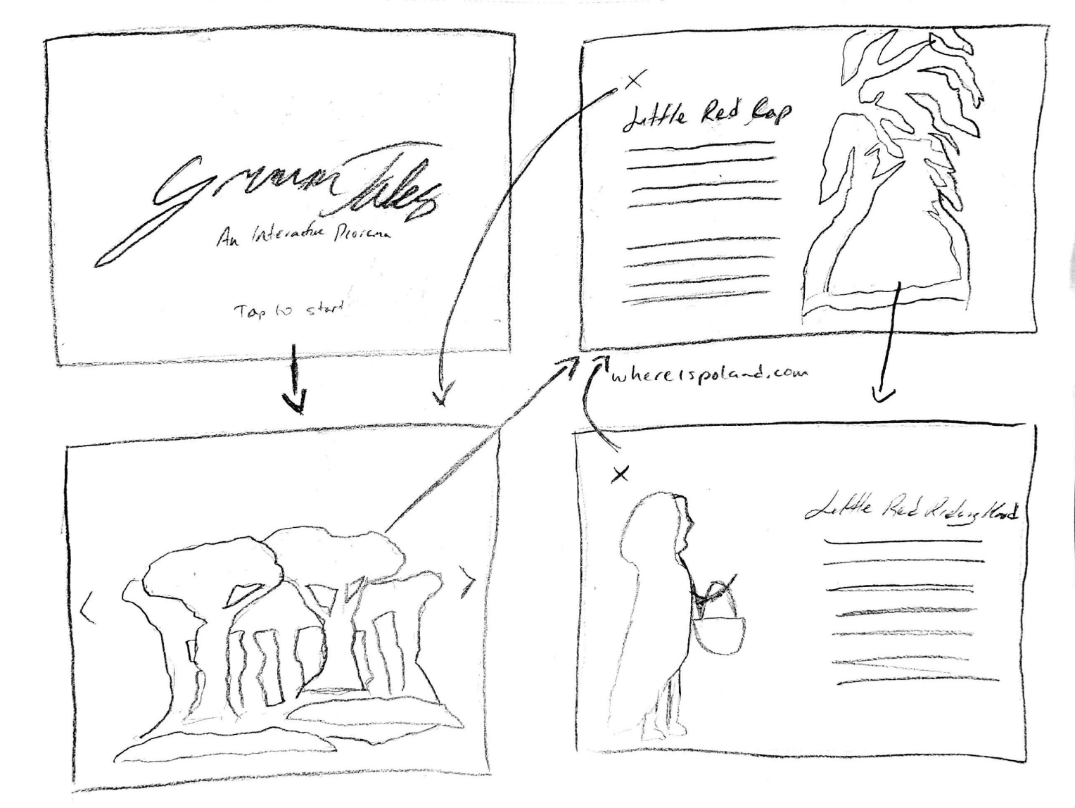
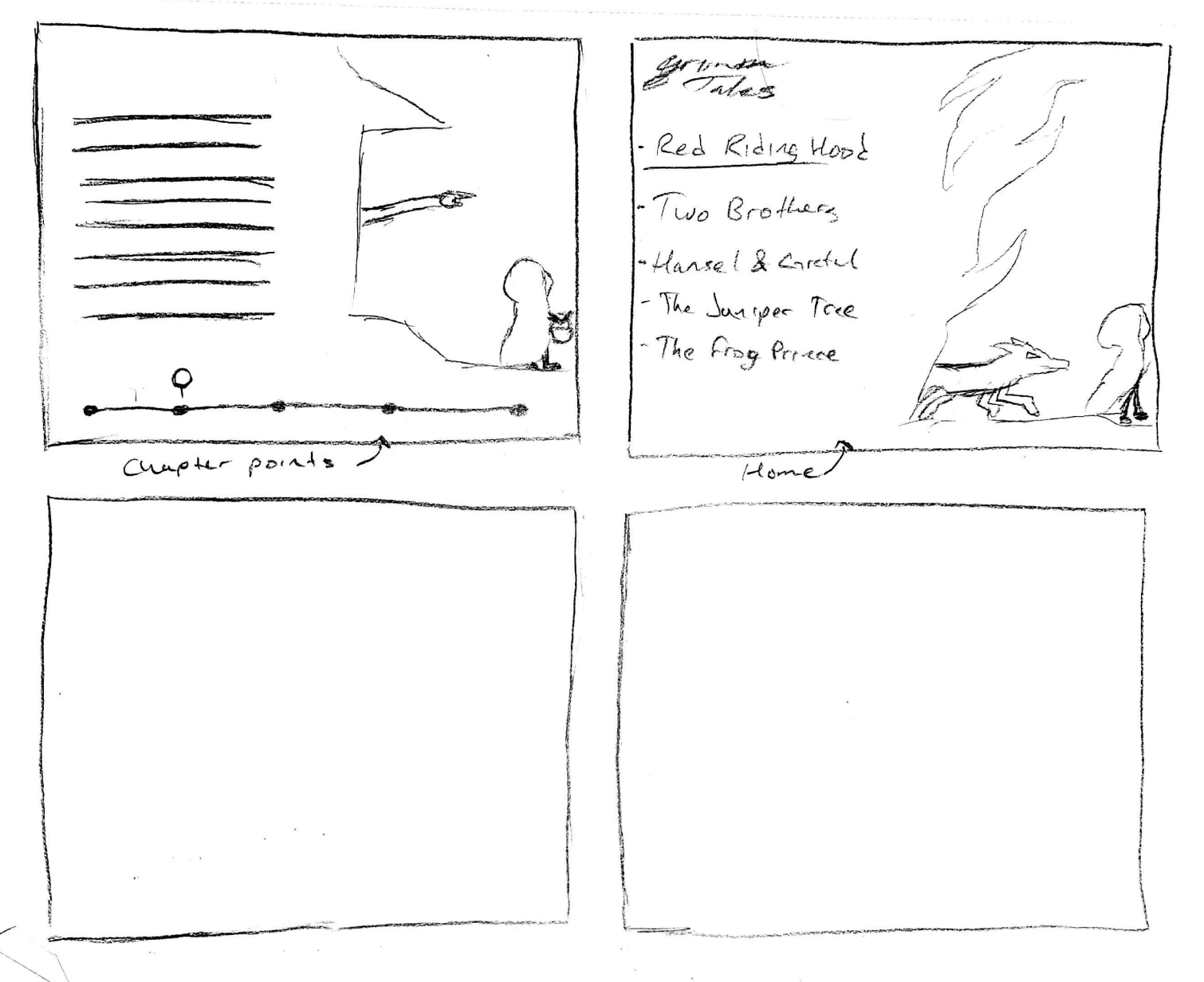
Wireframes
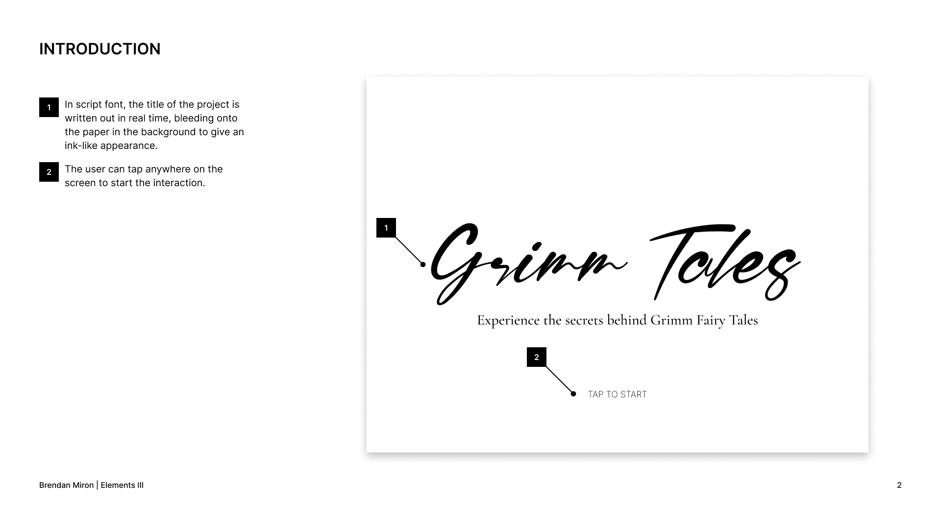
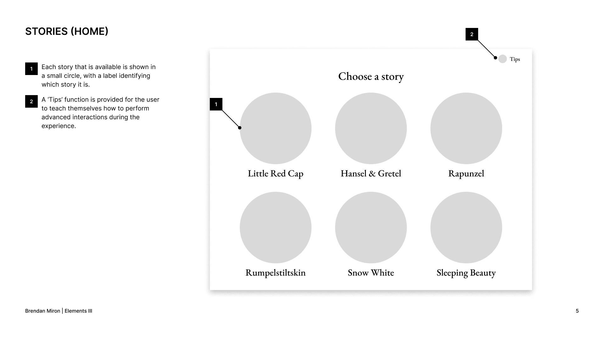
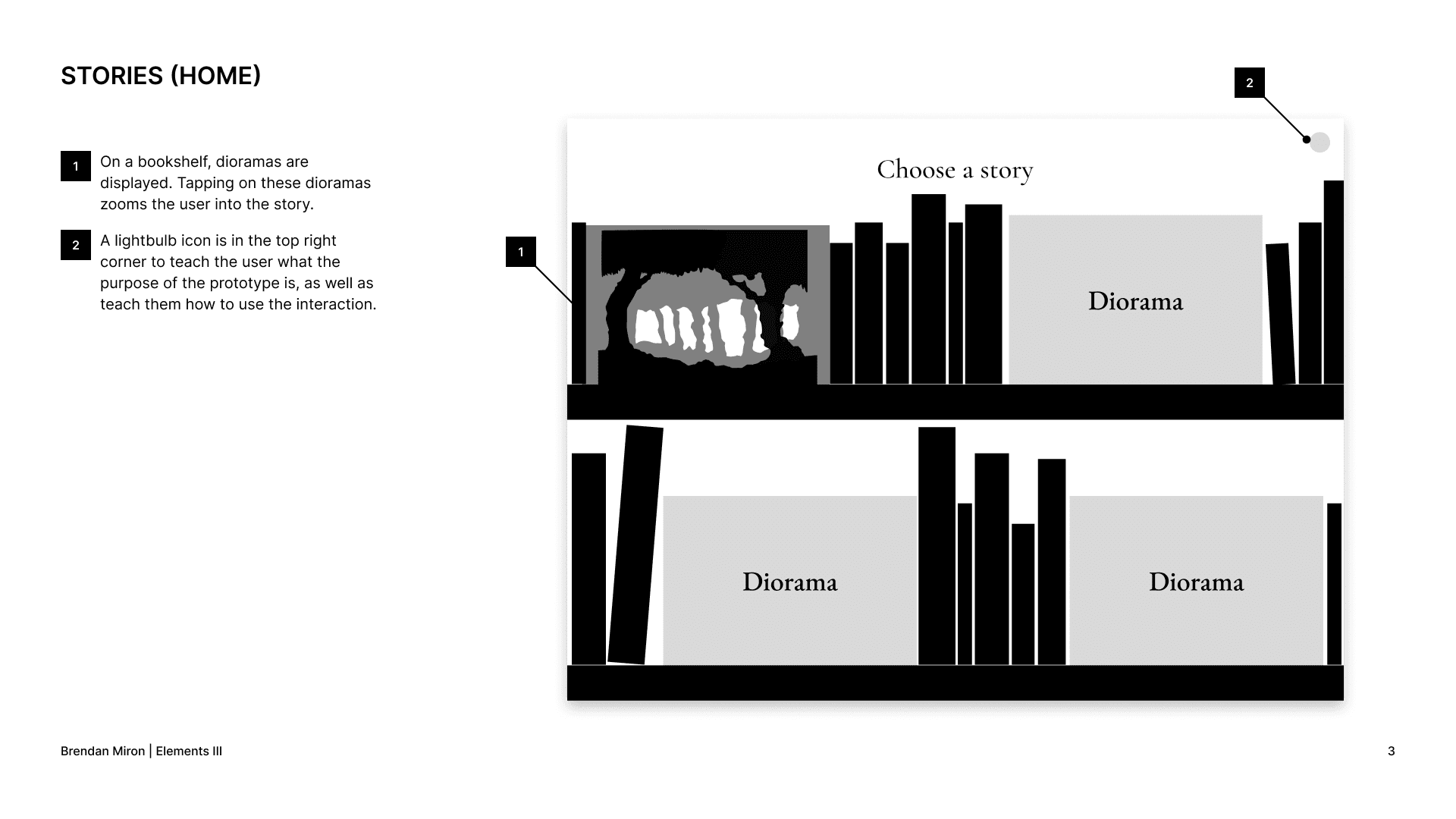
I had some trouble figuring out what I wanted my homescreen to look like, and spent the most time iterating on that page. As you can see, the style I went for does not reflect my wireframes, as it was kind of a last minute change.
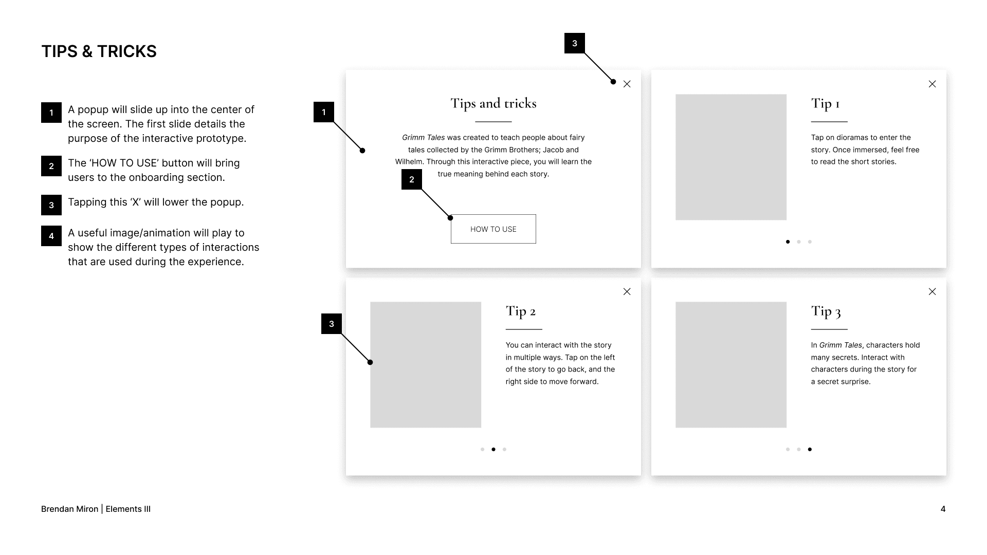
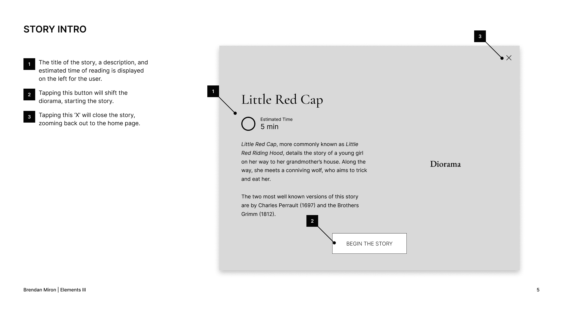
I also created annotated wireframe presentations to better understand the function of each element of the interface.
Design
Inspiration Board
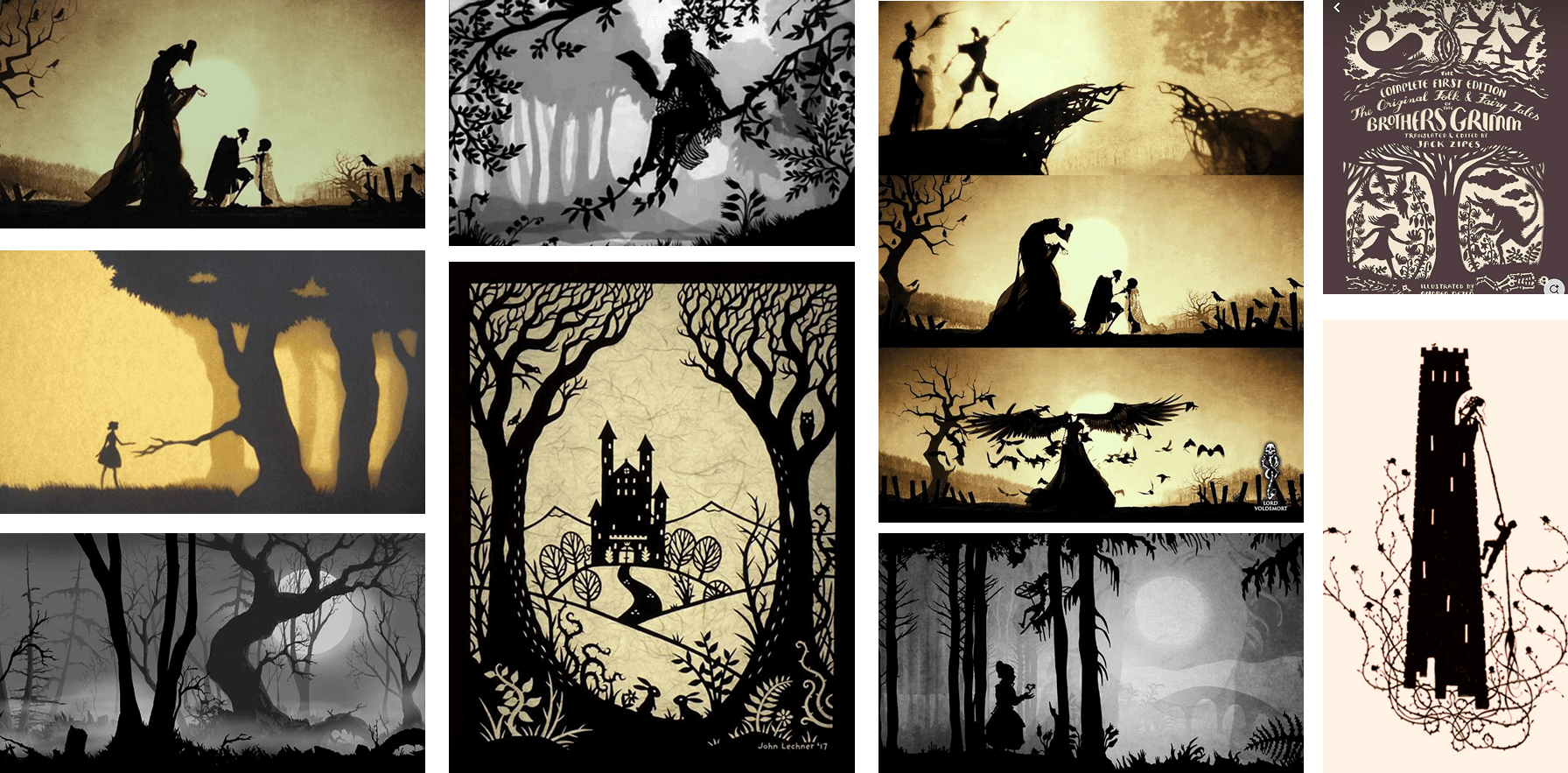
I wanted my visual style to represent silhouettes and puppet animation, like that of Lottie Reiniger. For my main source of inspiration, I used the Three Brothers scene from Harry Potter and the Deathly Hallows.
Visual Comps - Multiple Iterations
I spent multiple days and versions on visual compositions, trying to reach a style that fit with my vision the best. Shown below are some iterations for the Idle Screen, Home Page, and Story Page.
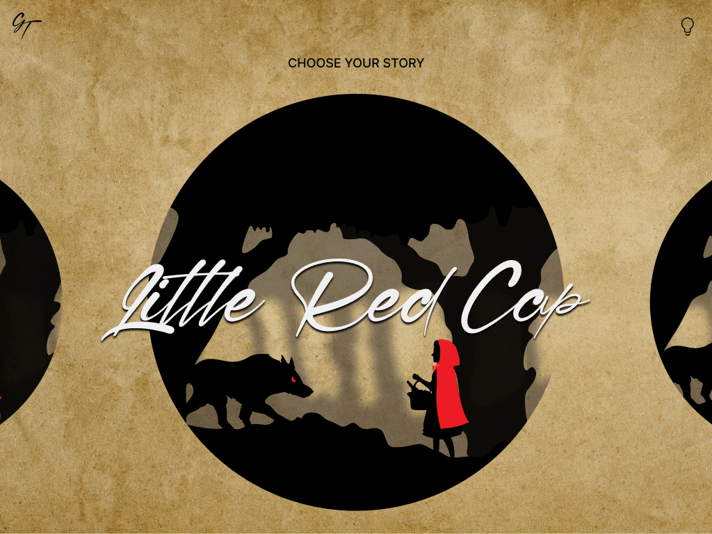
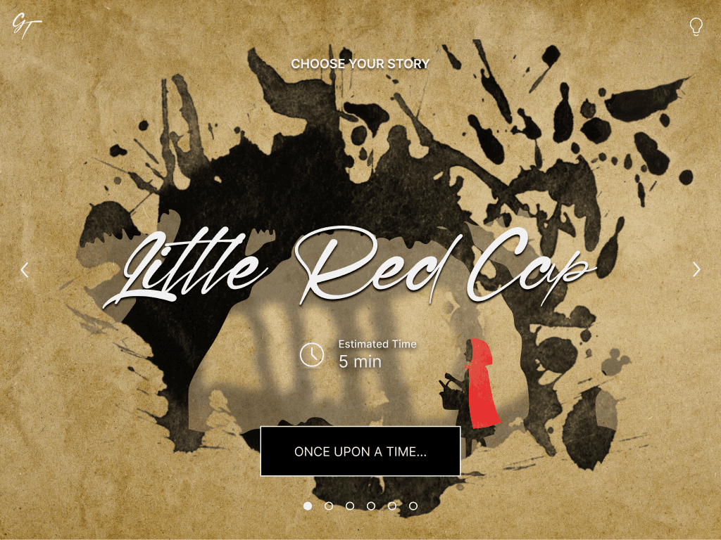
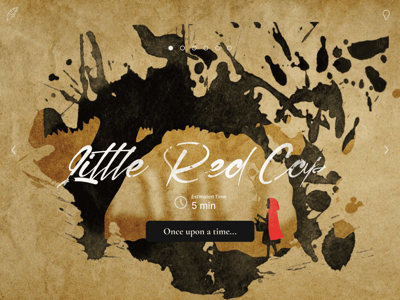
Final Compositions - Figma Mockups
Before heading into After Effects to edit and manipulate my content, I mocked up my designs in Figma to get a general sense of what the screens would look like. Some of the more advanced visual effects were only implemented in the final prototype, so please be sure to watch the prototype at the top of this case study!
Wrapping Up
What I Learned
This was my first time doing a project that relied heavily on animation, so I was, to be frank, quite nervous. I had no previous experience in After Effects. Despite this fact, I set out to achieve an animated prototype that I could be proud of, and I think I met that goal. There's definetly areas I could improve in, but that will come with time in the program, and after an extensive review of UI animation principles.
Interface-wise, I found it kind of difficult to design an interface that was mostly text based. It was hard to come up with scannable information that would be useful to a user. Since my interactive experience relies on the user WANTING to read (rare, I know), it was difficult to design for a wider audience. However, by providing small bits of scannable information, it helps my design reach more people, and keep them engaged.
This was a fun project that I'm glad that my professor let me do. Being able to choose any topic, as long as it was informative, was pretty broad, but I knew I wanted to do something regarding fairy tales. I've been working on a couple game design projects that revolve around fairy tales, so it was nice to get something out there that was about that topic.